Thursday 16 October 2014

LES BLEUS DE RAMVILLE


Les Bleus De Ramville opening title Evaluation

There are many factors of the "Les Bleus De Ramville" opening title sequence that I find very interesting and influential.


  • There are a few sequences in which I feel I would be able to replicate well, especially using the software iStopmotion, which I have practised and produced short footage already.In this particular opening the iStopmotion like footage is used to create suspense building up to a hockey match and I feel this is extremely effective. 
  • Another effective shot is a mid-shot from inside the locker and captures the ice hockey player reaching to get his jersey.  This shot makes the viewer feel included and he can therefore understand and empathise with the climax of the for coming game. I believe this shot would be simple to re create yet is also very useful in creating a compelling opening.
  • An important visual code in the opening sequence is colour contrasts. Here, the clear black and white theme  is effective in concentrating the eye. I feel again this would be easy to achieve but adds a memorable and significant touch. 
 
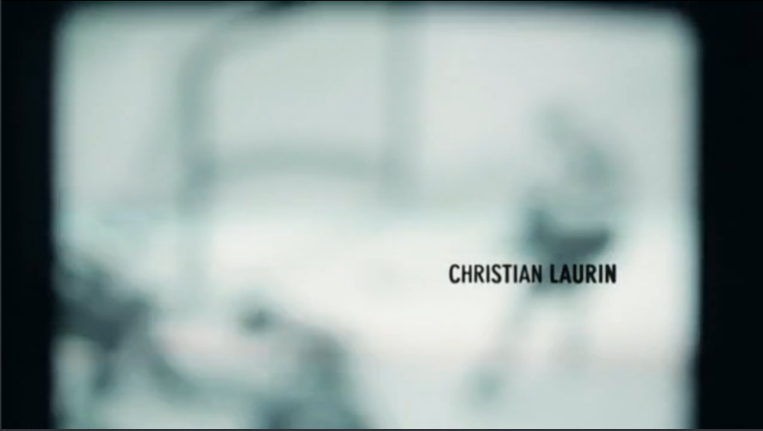
  • Something which I have noticed is the use of old footage. This particualr method of adding old footage adds authenticity and thought. When watching this title sequence this scene reminded me of a clever technique past Claremont media students used in there project called "National Security". I believe this technique is very effective in providing the evidence of research into your project.

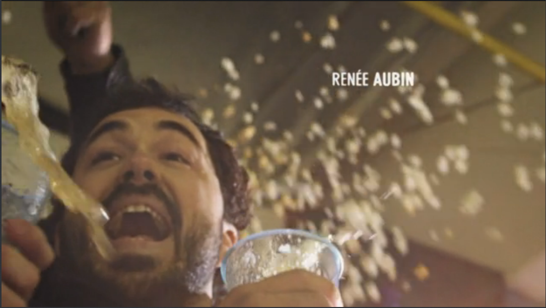
  • When filming,  a technique and prop often used is liquid. In this opening sequence a beer is spilt in a mid-shot to underpin excitement. It is also in slow motion which adds climax and helps the viewer to understand the pure happiness felt. When creating my opening sequence, for climax and suspence I will try to include a liquid.

  • Throughout the whole of the sequence the naming of the actors is carefully placed with uniformed font, sizing and colour palette. This is very professional, and creates routine throughout, without distracting the viewers eye. The writing is also strategically placed and the overall visual isn't crowded or distracting.

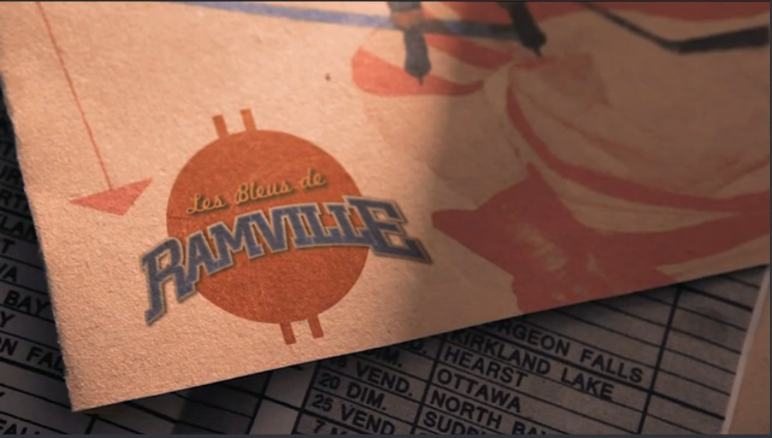
  • Another important element that this opening title sequence uses is incorpourtating the overall images and sequences together. This again, adds a slick intro into the beginning of the film, which provides a good overall impression. In the final cut, the title of the film is cleaverly weaved into the prop used. From this, I have learned that it is important to relate each scene, as this is the first impression the viewers will see.


Tuesday 7 October 2014

RESEARCH: DISTRIBUTION

PRIDE


  1. How are audiences involved in order to generate buzz prior to the film's release? 
Audiences take a big part in generating a buzz prior to a film release and they do this largely through varying media techniques. Using "PRIDE" as an example, they firstly created a video soundbite from actor Andrew Scott urging audiences to book tickets 'as there is only one week left.' This makes the views feel as though the actor himself is directly asking them, and put them in a position of power. Also, prior to the films release 'The real LGSM and stars of #PRIDE marched with a live band to Odeon Cinema, Camden on Tuesday 2nd September for the Premiere!.' This again, helped include the audience and made them feel part of the movie themselves. 
      Also, another helpful factor in generating a buzz is the #PRIDE. This is noticeably a new form of advertisement and is helpful in spreading the word and allowing the viewers to share there positivity towards the film to family and friends and overall get involved! Also another way in which "PRIDE" made the viewers feel more involved was by posting regular videos and backstage gossip. The website itself was also set up like a blog, creating a more relaxed, chatty and involved atmosphere. Finally the website included a live twitter feed that would tweet regularly helping the audience anticipation and excitement build as the weeks went on. Overall, I believe the advertising of the movie "PRIDE" was largely focused on the use of media, and using popular social mediums and engaging the audience with the actors themselves helped create a buzz surrounding the release.


PLANNING: IDENT

iSTOPMOTION

Today I explored new software, iStopMotion, using a webcam to take shots then editing using 'onion skinning'. The project was to make a production company ident for our imaginary company "S & T Productions".
When creating the ident, we were aware throughout that upbeat music would be needed in order to create more atmosphere and would help to underpin with the bright colours used throughout. 


Monday 6 October 2014

RESEARCH: DISTRIBUTION


What we did on our holiday 
  1.  Its genre? Source of your info? The genre is comedy/drama.
  2. Target audience? Source? Family film on a national scale.
  3. Institutions spreading the word? BBC Films, Virgin Media, Amazon, David Tenants blog.
  4. What did you learn about it from the trailer? The film contains humored childhood innocence and would be best suited for a family. I think it is aimed to emphasise and relate with everyone and is an overall feel good film, hopefully leaving everyone with a smile on there face. 
Sources: IMB, Google

Friday 3 October 2014

RESEARCH: THE ART OF THE TITLE

The Art of the title


Today I started to research opening title sequences in more detail...

As I am doing the film brief, I started my detailed research into opening credits..
In class I investigated the very useful website The Art of the Title http://www.artofthetitle.com.

American Horror Story- Directed by Kyle Cooper (2011)


For my first piece of close analysis, I used my own observations, class discussion and the overall knowledge Ive earned from my time in Media lessons, to understand the title sequence of "American Horror Story" further. 
  • The genre of this film is horror, so because of this the title design is enigmatic and disturbing, using dark colours and unusual images. This invites the viewer as the pictures are strange yet inviting because it is exciting to the eye. 
  • Throughout the sequence, but particularly at the beginning the use of childhood innocence is noticeable, and with the mysterious background music it again adds a uncomfortable sense underpinning its genre.
  • The period that the film is set is again clearly established through the use of scientific and old dusty images, it is obvious it is a present or 20th century horror.
  • Colour and lighting arkey visual codes. The sepia tone lends a period air and the colour black predominates, underscoring thgrim nature of the subject matter: the objects are all the dusty possessions with unusual images displaying a scientific theme present.
Casino Royale

REPRESENTATION


Representation
  1. Roland Barthes Mythologies (1964): state what you learned about his approach and how you 'read' this image. 
  2. Roland Barthes The Rhetoric of the Image(1977): explain what you understand by 'rhetoric of the image' and deconstruct the Panzani advertisement.           After watching an article by Daniel Chandler Semiotics for BeginnersI found deconstructing the Panzani advertisement and Barthes,"The Rhetoric of the Image(1977)"  advertisement much easier. Firstly, the Panzani advertisement is a denotation ands purpose is to overall underpin the view that this is fresh, italian and family loved food. In the photograph, there is clearly a strict colour scheme, this being red, green and white again helping to imply the Italian home cooked food, since these colours are the same as the Italian flag. The use of the netted bag, demonstrates the food has been picked up from a market and this again illiterates the freshness of the following products, reassuring the viewers that they are purchasing only the best. This advertisement stunt, is also supported by the fresh produce of mushrooms, a tomato and potatoes being placed around again adding a rustic and organic sense. Finally, the use of the produce overflowing in the bag, underpins the the views that this Italian, wholesome buyer can't get enough of the Panzini range, and obviously that it is just as good as homemade ingredients.
  3. Choose a photo from a recent film and analyse the representations depicted. For example, what would you say about either of the stills from Pride(2014)?  The photo I've chosen is from a scene in the recent film "The Fault in our Stars". It displays a wide shot and on the left hand side the character Augustus “Gus” Waters, grinning looking to the side of the camera holding a packet of eggs. He's wearing a dusty, brown and vintage looking leather biker jacket, which underpins a “bad boy” persona indicating to the viewers that he is rebellious, and possibly using the eggs to break the rules. The posture and gesture of the protagonist conveys the feeling of drama and elation. Out of focus in the background is what looks like a housing estate, which may imply that Gus is egging a well-kept and respectable house. His overall relaxed posture shows that his fractious actions are possibly not a big deal in his eyes, again implying his unruly behavior and characteristic.
In the middle is the character Isaac, who is crouching down, with his mouth wide open in disbelief. This implies that he is possibly shocked by Gus's actions yet intrigued and supportive, and this is evident by his conserved posture and how he isn't stopping him from proceeding. From research, Isaac is wearing glasses because he is blind, but this wouldn't be clear to the viewer with no background knowledge, which implies that the character is treated as an equal throughout the film.

Lastly, the character on the far right is Hazel Grace Lancaster who again is carrying a box of eggs, yet these are unopened. Her posture evidently shows her awe and shock towards Gus throwing them, and this is underpinned through her hand covering her mouth.  Finally, again through research and watching the film I know that Hazel had cancer and due to this experienced hair loss, which again is covered by the beanie. In this shot of the film, both Isaac and Hazel are covering there illness through items and this conveys all of the three characters as equals and doesn’t heighten there individual and personal issues.

Thursday 2 October 2014

PRELIMINARY EXERCISE

Preliminary Exercise 

We devise, film and edit a short exercise in film making which OCR asks us to complete prior to our film opening. We watch examples of the exercise such as those undertaken by Claremont students last year and others like this one.
Here is another example. Here is another.

As a group myself, Ellen, Tammy and Harvey filmed a short prelim with Tammy and I being the actresses and Harvey being the main camera man with Ellen helping with the background, cues and overall "behind the scenes" business. When filming we came across a few issues, one of the main being lighting. We filmed inside with natural light, again inside but with enhanced lighting and finally outside , and decided the second option was best. Another problem we occurred when filming was focusing the camera aswell as keeping it steady, as a result we ended up using a tripod and also had to refilm a few scenes due to them being out of focus. As a group we were extremely happy with our first experience filming, and made sure to include a shot/reverse shot and the 180-degree rule. When it came to editing we were all fairly new the the software, iMovie but got to grips with it rather quickly and soon enough were able to crop areas of film and add non-copyrighted music. Both a positive and negative was that as a group we had so many different ideas it was hard to limit the prelim to a maximum of 2 minutes and had to refilm and cut out sections. I view this as both a positive and negative as when it comes to the main film it has assured me we will not be short of creative ideas and will have more lean way with time.